The library that makes the outside world disappear
Deep green built-ins, worn leather, warm brass, and the smell of old books — how to design a home library that darkens the external world so the internal one can burn brighter.
A library is not a room for doing. It is a room for disappearing. The best ones understand this — they are designed not to impress visitors but to swallow you whole, to make the outside world recede until all that remains is the page in front of you and wherever it takes you.
The philosophy behind this space is simple: darken the external world so the internal journey can burn brighter by contrast. When the room itself is dim and rich and enveloping, the light of a good paragraph becomes extraordinary. You are not distracted by the view out the window or the brightness of a white wall. You are here, in this chair, in this story.
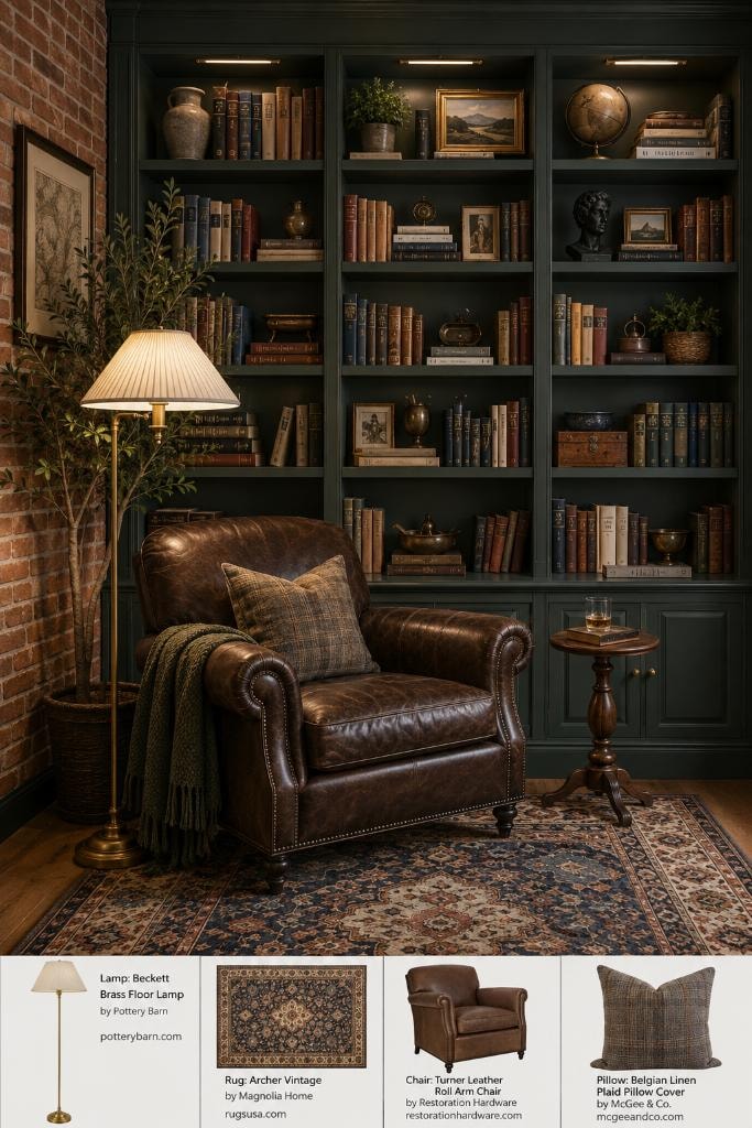
Everything begins with color. The built-ins are painted a deep hunter green — not the trendy sage that's been on every mood board for three years, but something darker, older, closer to forest floor than garden wall. Against exposed brick, it reads almost like a natural material. The room doesn't feel decorated. It feels grown.
The leather chair is the heart of it. A Turner Roll Arm from Restoration Hardware in a tobacco brown that will only get better with age — the kind of leather that holds the warmth of whoever sat in it last. Leather has a memory. It softens in the places you sit most, stiffens where you never do. A good leather chair becomes a record of your reading life.
Tactile details matter here more than anywhere else in the house. The cool, smooth weight of a hardcover spine. The slight resistance of a well-made page between your fingers — that particular texture that is nothing like paper and nothing like fabric but entirely its own thing. The nubby wool of a plaid pillow against your arm. These are not decorative choices. They are sensory ones, and they compound.
Lighting is the most important decision in a library and the one most people get wrong. Overhead light is the enemy. It flattens everything, kills atmosphere, and makes a beautiful room look like a waiting area. What you want is pools of warm light — a brass floor lamp positioned just over the shoulder, angled down toward the page. The Beckett from Pottery Barn does this perfectly: a pleated shade that diffuses the bulb into something soft and directional, mounted on a brass stem that adds warmth even when it's off.
The rug anchors the whole composition. The Archer Vintage from Magnolia Home is a traditional Persian-inspired pattern in navy, rust, and cream — the kind of rug that looks like it was found rather than purchased, like it traveled here from somewhere more interesting. Layered over wood floors, it softens the acoustics of the room. Libraries should be quiet. Not just visually quiet — actually quiet, the kind of quiet where you can hear yourself think.
The shelves themselves deserve attention. Books are the obvious starting point, but the objects between them matter too. A brass globe. A small bust. A framed botanical print. A wooden box whose contents you've forgotten. These are not styling props — they are the accumulated evidence of a curious life, and they belong in a library the way dust belongs in an archive: not as neglect, but as proof of use.
There is one more element that no product can provide but every good library has: smell. Old books have a scent — vanillin from the breakdown of lignin in aging paper, a faint mustiness that is not unpleasant but deeply specific. It is the smell of accumulated thought. If your library is new, it will take time. But it will come. In the meantime, a candle with notes of leather, cedar, or tobacco will do the work of suggesting what the room is becoming.
Design a library like this and you will find yourself in it more than you planned. You will sit down to read for twenty minutes and look up to find it's dark outside. That is not a failure of productivity. That is the room working exactly as intended.